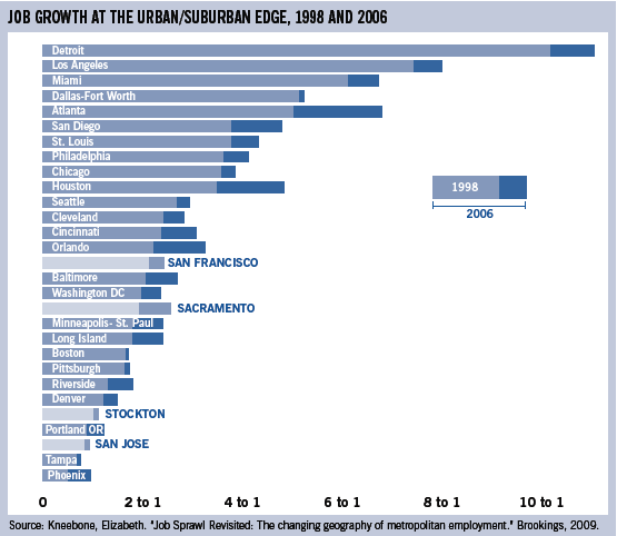
[Source: The Urbanist] — This graph is a jobs index comparing the jobs located more than 10 miles from CBDs to jobs located within three miles of CBDs. The dark blue sections show the difference in this ratio between 1998 and 2006. For instance, the ratio for Phoenix is 1:1, meaning Phoenix experienced 100 percent more growth at its urban boundaries than it did in its city center. The lightest areas show the values for cities within the Northern California megaregion. [Note: Read the full article at Job sprawl in the megaregion.]

